ITP Classes (old posts, page 15)

Tisch Soundwalk and The Machine Stops

Tisch Stairwell Soundwalk

Our class project was to create a Soundwalk within the Tisch building. I worked in a group with my fellow students Chian Huang and Ella Chung.

Our idea was to record the audio of ourselves walking from the main entrance of Tisch up all 12 flights of stairs to the top of the building. We added sound effects to our recording that were inspired by the departments or activities of each floor.

To go on this soundwalk, enter the Tisch building located at 721 Broadway in New York City. Present your ID to the guard and walk to the stairs to the right of the elevator. Go through the door and walk up all the steps.

Read more…

Signage and Information Systems

This week's topic is signage and information systems. Our assignment was to find examples of well designed signage and analyze what it is that makes it effective, and to find examples of poorly designed signage.

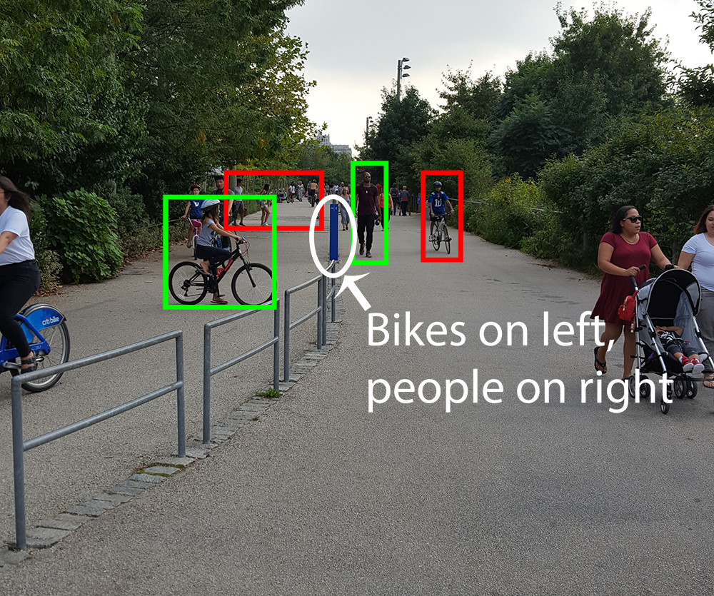
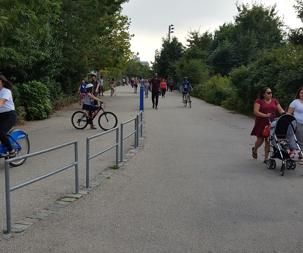
My first thought of poor signage is in Brooklyn Bridge Park. I live in the area and do volunteering there on a regular basis. In the park there is a path running through the entire area that is open to bicycles and pedestrians. Here is an example:

bike and pedestrian path in park with trees to the right and left and a metal fence going down the center. A small blue post delineates which side of the path is for bikes and which side is for people.

There is a mixture of people and bicycles everywhere. It's hard to notice the tiny blue sign in the middle that instructs bicyclists to stay on one side of the path and pedestrians on the other side. There are only a couple of signs like this anywhere along this mile-long path. This is an accident waiting to happen.

Bike and pedestrian path in park. Bikes and people who are where they are supposed to be have a green box around them. Those that do not have a red box. The text "Bikes on Left, People on Right" is added to the center of the image.

Read more…

First Electronics Lab and Weekly Readings

Electronics Lab

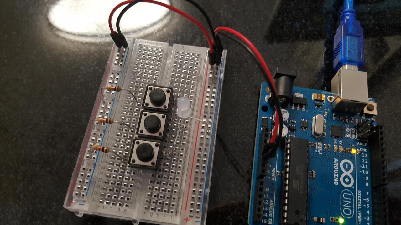
Our assignment was to create something using switches. My goal was to use 3 switches and a 3 color LED to make a circuit that can produce any color.

First I wired a circuit with a 3 color LED, 3 1K Ω resistors, and 3 buttons, like so:

Arduino, breadboard with 3 buttons and 3 identical resistors, all connected to a 3 color LED.

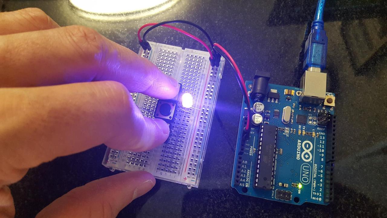
I am using my Arduino to power the board. Each button can be on or off, so this can produce 8 different colors. In the picture below I am activating the blue and red colors, making magenta.

two of my fingers pushing down on two buttons, lighting up the LED

Read more…

Introduction to Rhino

For our first class, we were introduced to the Rhino modeling program. Our assignment was to build something that fits in a 3 inch cube using the commands we learned about in the lecture.

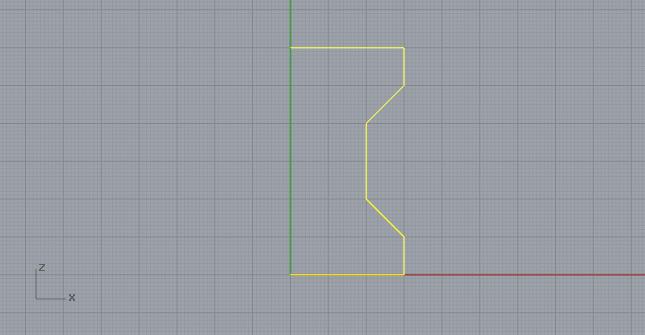
My goal was to make a standard rook chess piece. To begin, I created a new workspace with millimeter settings (as instructed by Xuedi) and turned on the grid snap. Using the Polyline command, I drew a rough outline of the contour. My intention was to later use the Revolve command.

Gray grid with green and red axis lines and crude outline of rook chess piece

Read more…

Introduction to 3D Printing

Introduction to 3D Printing, taught by Xuedi Chen.

Class blog posts:

Basic Design Principles

Our first assignment is to choose a design we like and analyze its adherence to the principles of design. We needed to look at the grid system, color system, and the fonts.

I picked the movie poster for the movie The Grey. I find the imagery to be visually striking in a way that is consistent with Liam Neeson's character in this movie.

The most primary feature of this poster are Neeson's eyes. His eyes are the most noticeable and are the only blue thing illustrated on the poster. After his eyes, the prominent features are the movie's title and the redness of his mouth and the cut on his face.

Movie poster for the movie The Grey. A close-up of Liam Neeson's face, which has a beard and several cuts on it.

Read more…

Soundwalk and Week 1 Readings

The Gaits: A High Line Soundwalk

A Soundwalk is a directed walk with a focus on listening to sounds instead of viewing sights. I went on The Gaits Soundwalk, a soundwalk commissioned by the High Line park in NYC. This is an above-ground park built on raised railway tracks abandoned years ago.

The Gaits Soundwalk is experienced with a phone app that only functions when the user's phone is actually on the High Line. I actually thought the app was broken when I arrived at the beginning of the High Line on Gansevoort St. It began making bell noises when I started to ascend the stairs.

For the first five minutes or so the Soundwalk consisted of only intermittent bell noises that would slow down or stop when I stopped walking. As I moved along, the walk got more interesting. The bells sped up, and then an organ was added. I heard water churning at several locations, and while at sections of the walk with seating for viewing parades or other city activity, I heard applause. There were also birds chirping in the section of the walk with a lot of trees. Unfortunately there was construction and scaffolding covering everything so there were no actual birds to be seen. Still, I do appreciate the synchronicity to the environment.

Read more…

What is Interaction?

The Art of Interactive Design

In Chris Crawford’s book, The Art of Interactive Design <https://www.amazon.com/Art-Interactive-Design-Euphonious-Illuminating/dp/1886411840/>`_, Crawford defines interactivity in terms of a conversation. Specifically, interactivity is a cyclical process of two actors taking turns listening, thinking, and speaking.

Unfortunately, the word "Interactive" is often explained or defined poorly, and as a result is poorly understood by our culture. The term gets added to products as a buzzword to make them sound better, but often the objects don’t really "interact" in a way as described by Crawford’s definition. There is no "conversation" or cyclical process.

A literal conversation between two people fits this definition literally, but when the interaction is between a human and an electronic device, the steps become input, process, and output. Key point though is that there are two actors, not one. Each actor is some kind of "purposeful creature," so a wall or a rug cannot be interactive.

It isn’t always clear if something is interactive or not. Rather than being a boolean thing, there are different degrees of interactivity. We can evaluate high or low levels of interactivity by evaluating the quality of the listening, thinking, and speaking steps. Excelling in one area does not compensate for failures in another. A common design error when building interactive products is to fail to appreciate this idea.

Read more…
Physical Computing

Physical Computing, taught by Tom Igoe.

Class blog posts: