Signage and Information Systems
This week's topic is signage and information systems. Our assignment was to find examples of well designed signage and analyze what it is that makes it effective, and to find examples of poorly designed signage.
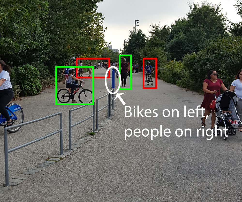
My first thought of poor signage is in Brooklyn Bridge Park. I live in the area and do volunteering there on a regular basis. In the park there is a path running through the entire area that is open to bicycles and pedestrians. Here is an example:

There is a mixture of people and bicycles everywhere. It's hard to notice the tiny blue sign in the middle that instructs bicyclists to stay on one side of the path and pedestrians on the other side. There are only a couple of signs like this anywhere along this mile-long path. This is an accident waiting to happen.
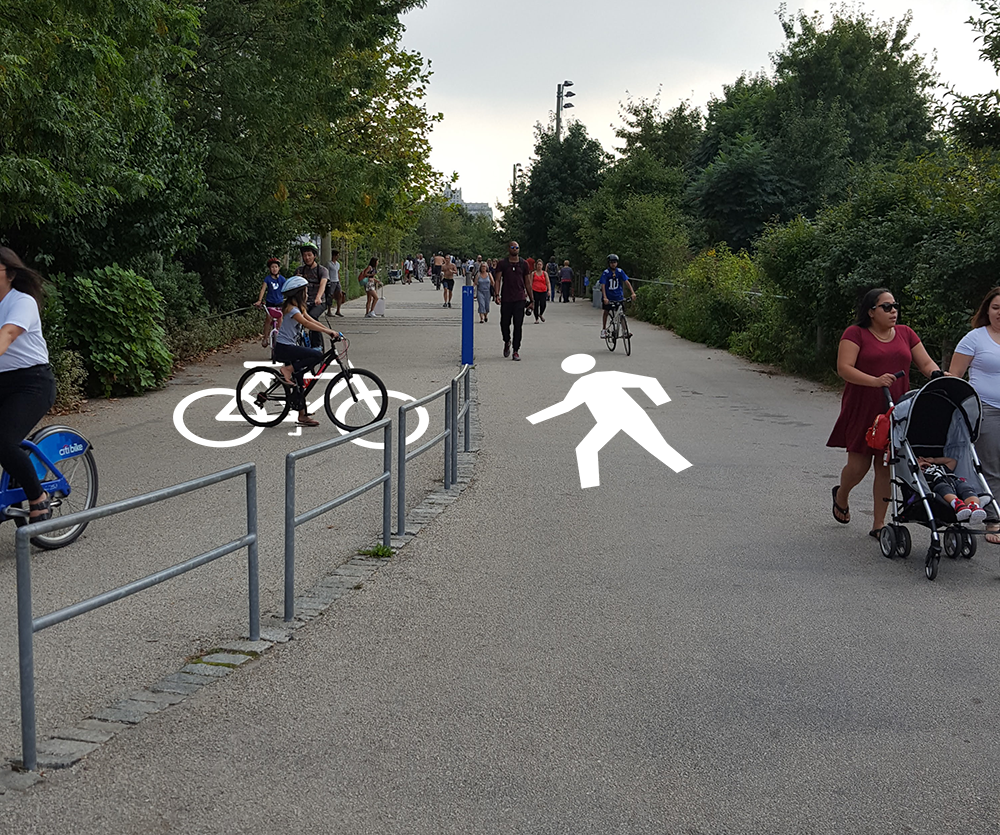
To fix this I would suggest painting instructions on the ground near the park entrances and at regular intervals along this path. It would be an unobtrusive way to communicate a safer way for bicyclists and pedestrians to share the same space.
My next example was this advertisement for the educational facility Apex.

Although it might not be the best example of what would be categorized as "signage," it is an example of poor design. It employs a kaleidoscope of fonts:

To redesign this, I kept the company logo and industry illustrations while simplifying the message on the right side and reducing the font choices.

For examples of good design, the first thing that caught my eye was this advertisement for the ride-sharing service Lyft:
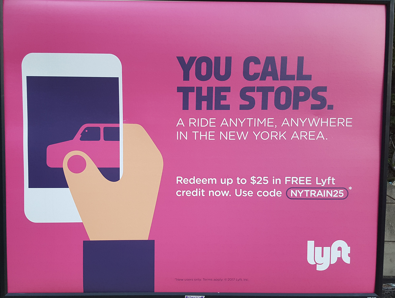
There is a simple grid system lining up the text horizontally and vertically with the illustration. There are only a few colors and two different fonts.

I particularly like the illustration. The designer was able to combine a hand, a car, a phone, and the driver's face into one illustration. It is a visual metaphor for the relationship between these things.

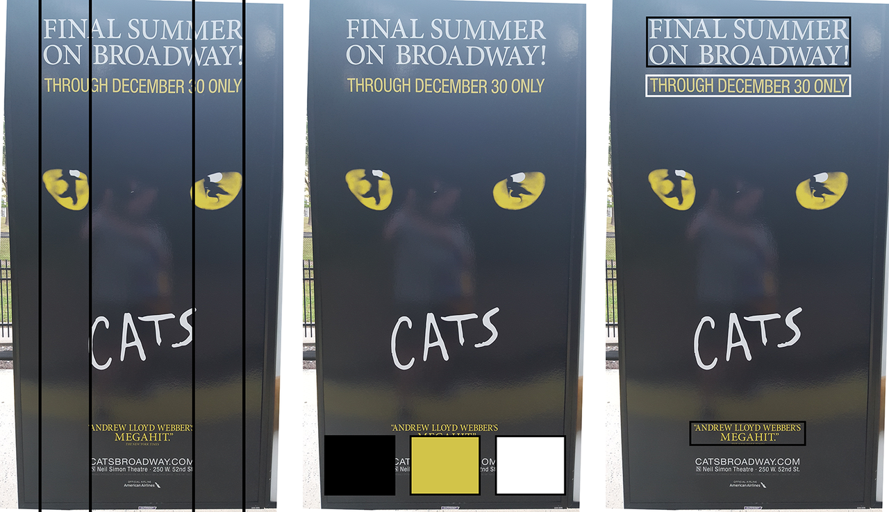
My next example of good design was this advertisement for the musical Cats.
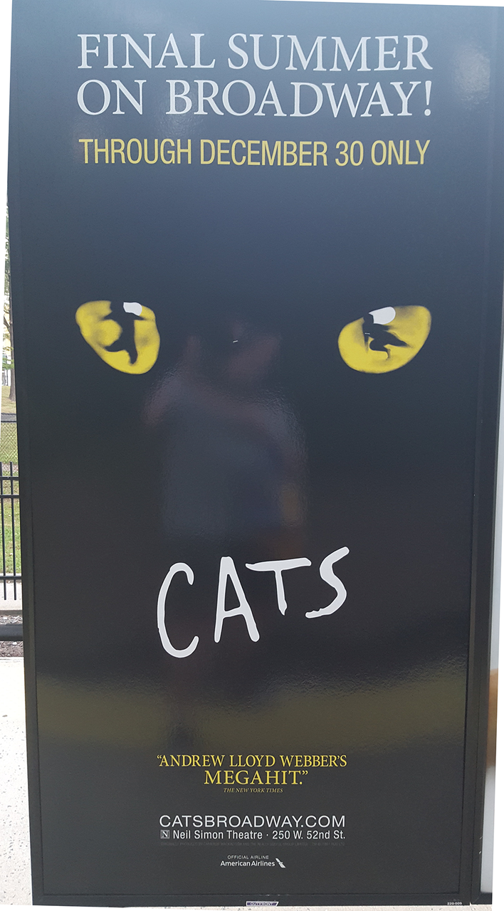
The grid system on this diagram lines up the text with the inside and outside of the cat's eyes. There are only three colors and two fonts.
I grew up in the NYC area and I've seen advertisements for Cats over a million times. One detail I never noticed before is the cat's eyes. They contain the silhouette of dancers:

It's a subtle detail waiting for a careful observer to notice.
Comments