Business Cards
Our final Visual Language assignment is to design business or personal cards. It happens I already had personal cards but I wanted to update my design to incorporate what I have learned in this class.
The main goal of my cards is to provide some interaction and enjoyment to the people I give them to. Usually cards are boring and are tossed into a drawer somewhere shortly after they are received. Often they are given out to communicate status or corporate identity. I want my cards to be different. I want to communicate my ability to be creative and engage people in a unique way. And I do that by designing connect the dots puzzles for the backside of my cards.
I print my business cards at moo.com. It is a little bit more expensive than other printers but instead allowing customers one and only one design, moo.com allows customers to create a unique design on the backside of each card. A customer can print 50 cards with 50 unique designs.
The size of moo.com's business cards is slightly different from the standard size of 3.5" by 2". The card's trim dimensions are 3.3" by 2.16" with a safe area of 3.15" by 2". The bleed area is 3.46" by 2.32". The cards can be printed on paper without a glossy finish that allows people to write on the cards.
The front of the redesigned card is below. I thought it would be a good idea to make the color theme and fonts match the color theme and fonts of this website. I spent a lot of time reviewing fonts that are good for the web and print and selected PT Serif and OpenSans. The front of the card is PT Serif, as is the text you are reading right now. The title of this blog post is in OpenSans.
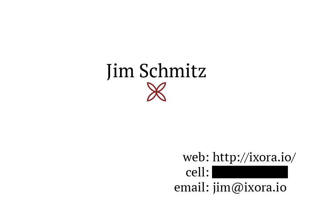
The logo is an illustration of ixora flowers. I wanted to add a logo of some kind and I wanted to keep it very simple so it didn't compete with my design for the rear of the cards.
Five designs for the backside of the cards are below. All are connect the dots puzzles I designed in Processing. The design process for each of these was tedious but is heavily augmented with computer code. The font used for the numbers is OpenSans Condensed Light.
Note the below images have the safe area guidelines visible. The guidelines make it easier for me to prevent printing mistakes.
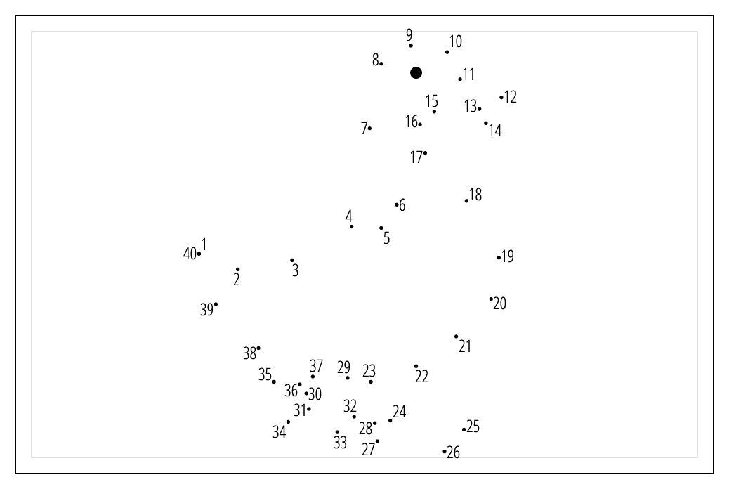
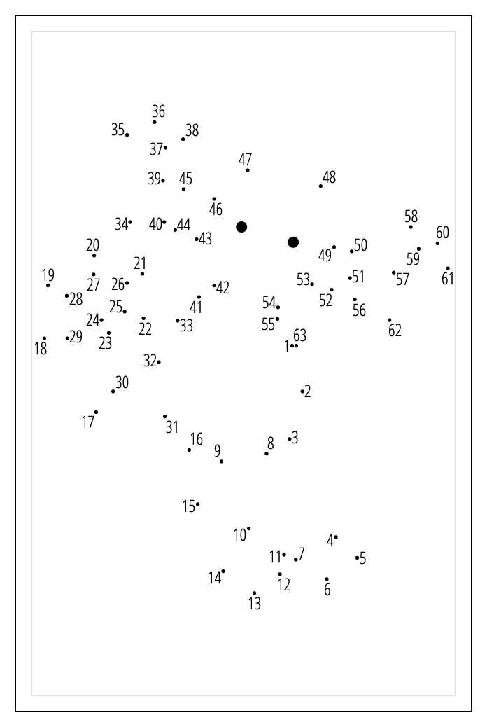
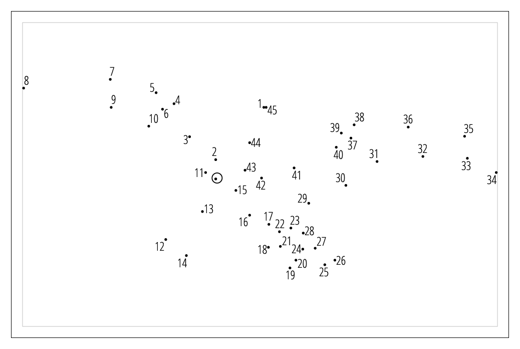
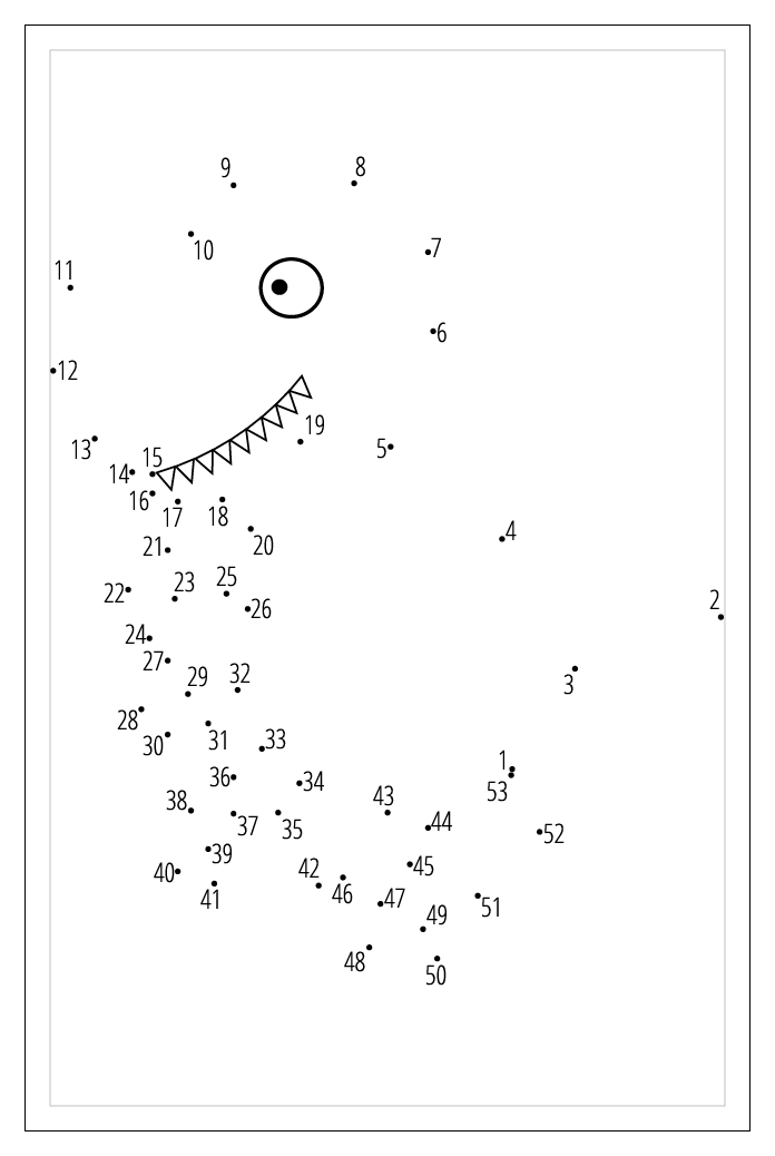
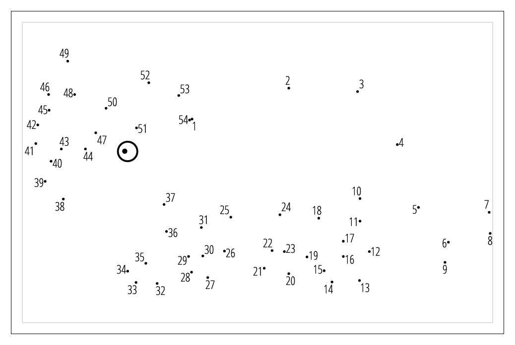
The major design challenge here is making the font large enough to be visible when printed on a card but not so large it limits the number of dots or resulting in numbers printed on top of each other. Using a condensed font helps with this and may allow me to increase the font size compared to what I was using before.
Below is a real drawing made by someone I gave a card to at a bar. The connect the dots puzzles can be easily completed, even in less than ideal lighting environments.
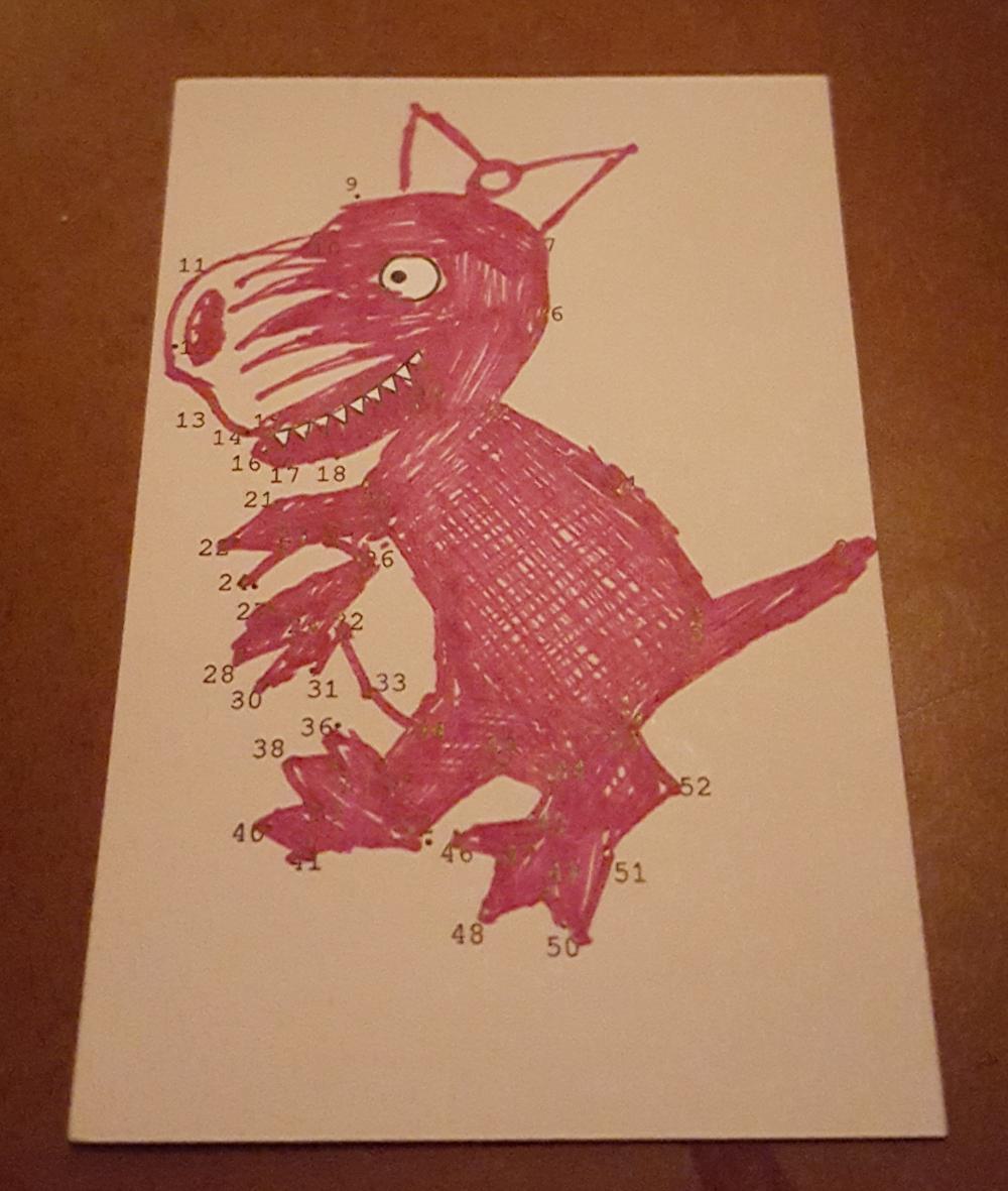
To a reasonable extent, the cards are engaging and interesting to the people I give them to. I had to go through several design iterations before I could develop something that used font sizes that are easily visible to most people and were not too complicated to complete. A connect the dots puzzle is fun and engaging and arouses people's curiosity about what they will get after completing it. I also have friends that already have my contact information and several of my business cards but ask me for any new designs when I make them. I think that makes my cards a success.
Comments