First Electronics Lab and Weekly Readings
Electronics Lab
Our assignment was to create something using switches. My goal was to use 3 switches and a 3 color LED to make a circuit that can produce any color.
First I wired a circuit with a 3 color LED, 3 1K Ω resistors, and 3 buttons, like so:
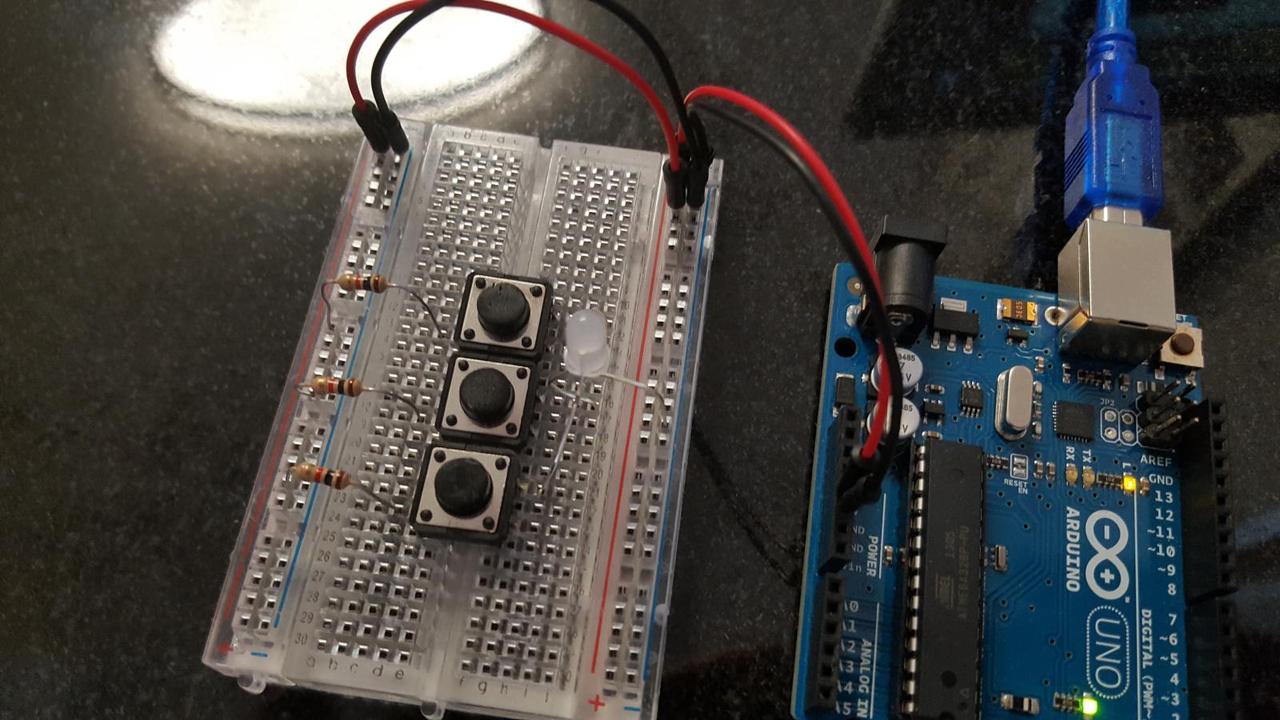
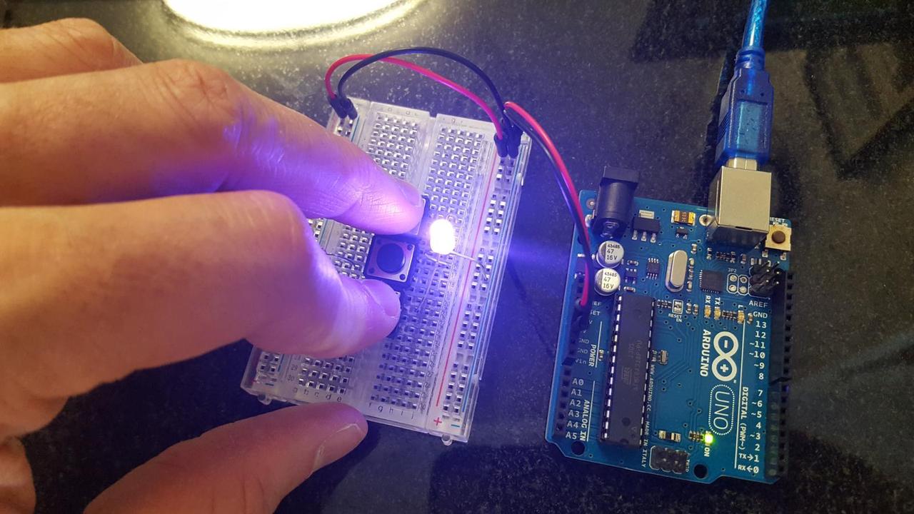
I am using my Arduino to power the board. Each button can be on or off, so this can produce 8 different colors. In the picture below I am activating the blue and red colors, making magenta.
It works, but there is a slight problem. When I activate red and green, I want to see yellow, but I get something that is closer to lime green. The green component of the 3 color LED is more luminous than the red and blue components. It drowns out the other colors.
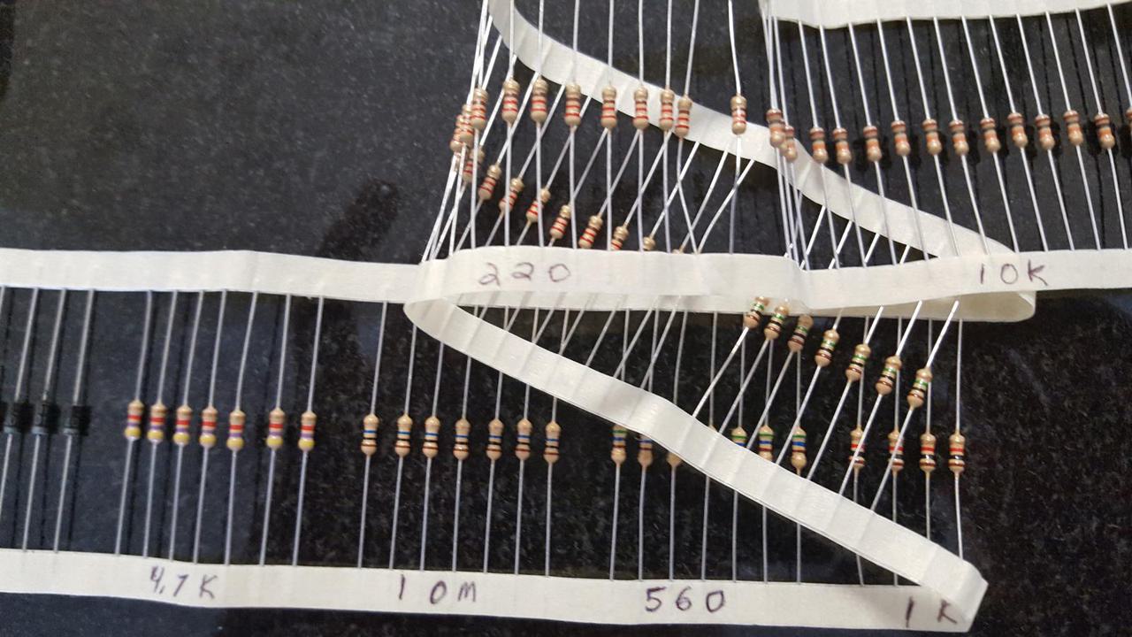
The 3 color components of the LED must produce different quantities of light for the same amount of current and voltage. To balance this out I adjusted the resistors. I increased the resistor in series with the green component to 4.7K Ω. I decreased red to 560 Ω and blue to 220 Ω.
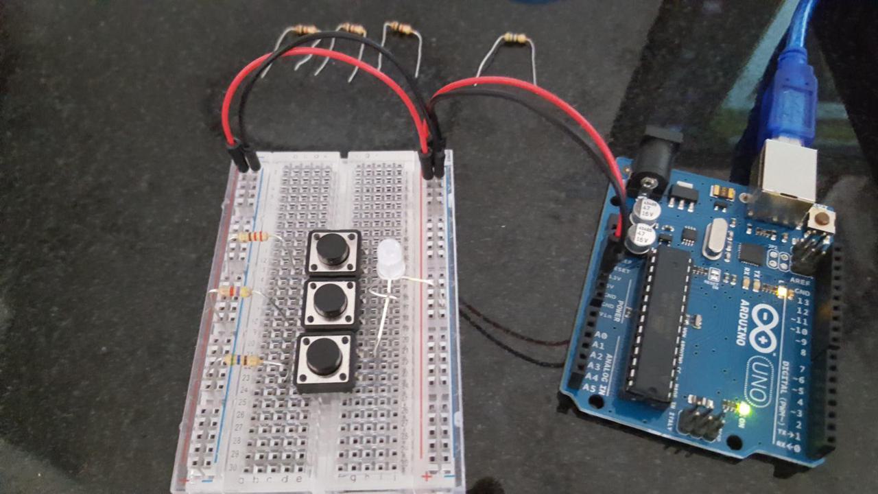
Now the luminosity of the 3 color components looks more balanced. When I push the buttons for both red and green, I get a nice yellow color. No color component overpowers the others, allowing me to properly produce primary and secondary colors.
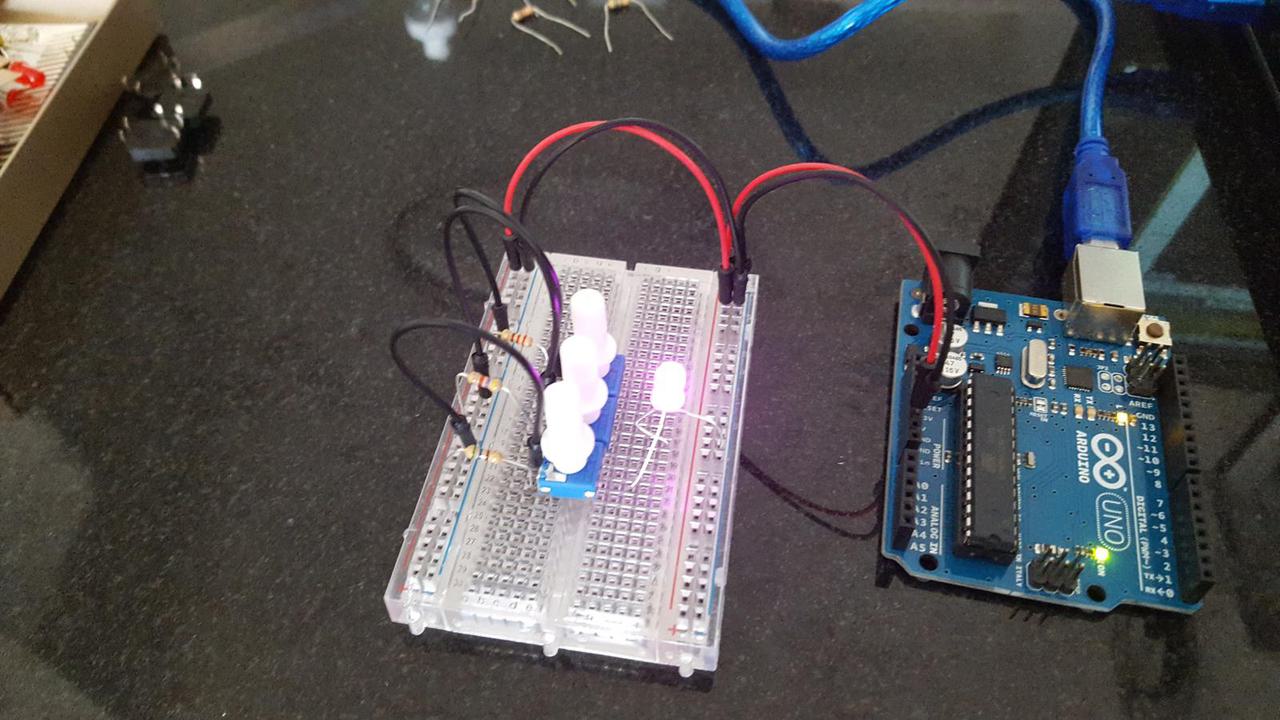
Finally, I replaced the buttons with the 3 potentiometers that came with my Arduino kit. I did some experimentation with a multimeter to see how they work. The minimum resistance of the potentiometer is zero so I must leave the other resistors in place to avoid breaking the LED. I can adjust the potentiometer dials to make any color within the color gamut of the LED. Below I am making a nice pink color.
Questions
I have one important question about Physical Computing that I would like to discuss in class this week. My question is about how to read resistor bands, and I don't want the answer to be "Go look at that resistor color band table." There are a million color band tools online that teach you how to read resistor bands or do it for you, and none of them seem to help when I have a resistor in front of me and I am trying to read it. There are complications: what do I do if I can't actually parse what colors are on the resistor? Sometimes a band looks like red, but then I see a different resistor with a color that is closer to red, so maybe that first band was actually orange. Do all resistor manufacturers have the same pigmentation for their color bands? How do you tell which direction to read the bands? Why do we have to use this color system anyway? Surely it is possible to print an actual number on these small components.
Whenever I get resistors I write the resistance setting on the tape holding the resistors together. When I pull a few resistors out I have reference for comparison. I just need to find the group of resistors that looks like the one I have, and then I know the resistance.
The Design Of Everyday Things
The goal of Donald Norman’s book, The Design Of Everyday Things, is to make us aware of the problems inherent in the design process and interest us in improving things. The lack of knowledge about how design affects the users of products causes much user frustration. Some think that design is merely about appearances, but it is really about usability and understandability.
Norman emphasizes the importance of studying people to understand their needs and interests so these can be incorporated into a design. To do this we must test design ideas on actual users instead of relying on instincts.
Our brains are designed to make sense of the world, and well designed things are easy for the brain to figure out. A poorly designed thing will have misleading or absent signals for their operation.
Norman writes about several principles of design that we should understand. The first is the principle of visibility. This means that the correction operating interface should be visible and should convey the correct message about how it should be used. Basically, there is a clear mapping between what the user wants to do and what is possible to accomplish with the controls. The actual effects or outcome of the operations should also be immediately apparent.
A user will look at an object and will form a conceptual model for what that object does and how it is used. This model is built when the user mentally simulates the object’s operation given the capabilities and limitations of the object. According to the author, “a good conceptual model allows us to predict the effect of our actions.”
The user’s conceptual model may not be the same as the designer’s conceptual model. The only way the designer and user can communicate is through the object itself, so the "system image" must communicate the designer’s model to the user.
The next principle is the principle of mapping. This is the perceived link between the object’s controls and the outcomes that will result from interacting with those controls. There exists a "natural mapping" whereby the mapping conforms to physical analogies (moving a control up moves an object up, etc) or cultural norms. This reduces the mental burden for figuring out how to use something.
The principle of feedback instructs to make the user receives information about what has been accomplished by their actions. This speaks to the "conversation" between two entities necessary for quality interactivity, as defined by Crawford in The Art of Interactive Design.
After this reading, I am struck by the idea of how important good design is in a rapidly changing world. Consider what life was like for humans 50,000 years ago. It was probably exactly the same a thousand years before or after that point. There probably was a lot of necessary knowledge about how to survive, but once learned, not much changed over the course of one’s lifetime.
Now consider our world today. The world is constantly evolving, and our lives change more in 10 years than they did in a 1000 years for the people living 50,000 years ago. Our world has thousands of man-made items and we need to identify them and know how to use them. Imagine the mental burden of having to stop and decypher how to interact with every new pen or door? Nothing could be accomplished. Good design is critical to alleviate the mental burden of living in an increasingly complex world.
Emotion & Design: Attractive things work better
Donald Norman's book, The Design Of Everyday Things, has been criticized as advocating usability over the beauty of objects. In the essay Emotion & Design, Norman addresses this criticism. He begins by introducing 3 teapots that he uses to make tea. One has intentionally poor usability design, one is visually appealing, and one is practical. He uses all of them, depending on his mood.
Norman argues that his intent of The Design of Everyday Things was not to deride beauty at the expense of usability. He says he wants usability to be "equal to beauty, equal to function: equal, but not superior." Beauty and usability exist on separate dimensions, and we don't have to sacrifice one for the other. And as Norman argues, they compliment each other, or at least, the beauty of an object makes it easier for us to learn how to use.
This essay makes sense to me, but there is something about it that bothers me. Perhaps I have a more utilitarian mindset than most, but often times I care the most about getting something done in the most efficient way possible. Results are about getting stuff done. The reality is the world is a difficult, ugly place, and you can't always count on designers being there to make things aesthetically pleasing for you. I do appreciate it when it happens, but in the end effective tools matter the most.
Perhaps this is why I am a Linux user.
Physical Computing’s Greatest Hits (and misses)
In Tom Igoe's blog post, Physical Computing’s Greatest Hits (and misses), he writes about Physical Computing projects he's seen in the past. This is interesting and contains some of the ideas I have thought about for my projects.
I didn't know what a Theremin was until a few days ago, and my idea that building one would be original ended 2 paragraphs into this post. Oh well...but I will make a musical instrument of some kind at ITP.
I have some ideas about video mirrors but I think I can do something there that is interesting and original. I also have some ideas for employing the Pepper's ghost illusion in a realtime Processing animation.
I'd also like to make projects involving body-as-cursor or hand-as-cursor. I'm interested in projects that use machine learning to interpret body mechanics as input.
And I'm not making things you yell at. I don't like yelling at things.
Comments