Experiments With Sound
Upcycling a Speaker
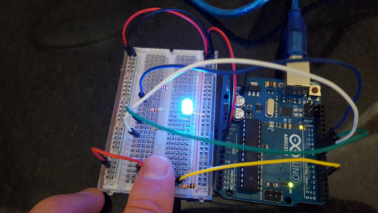
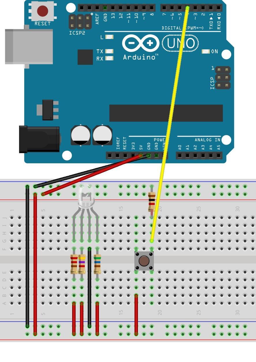
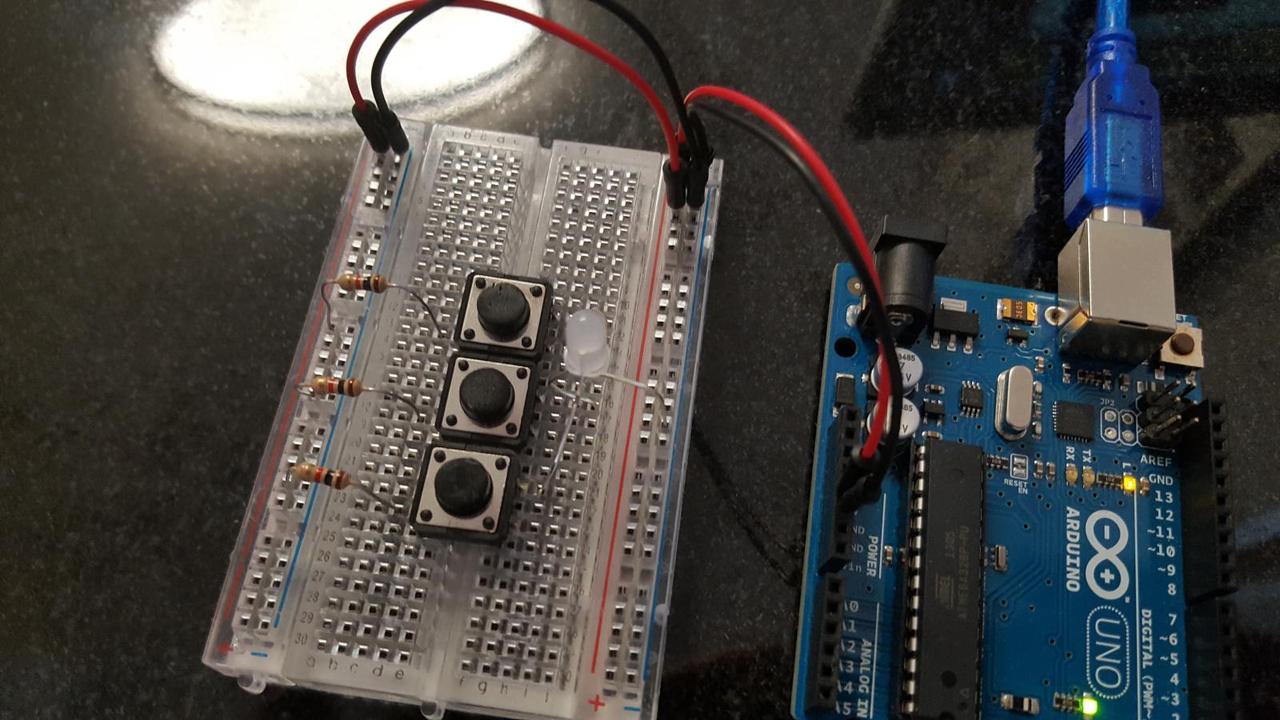
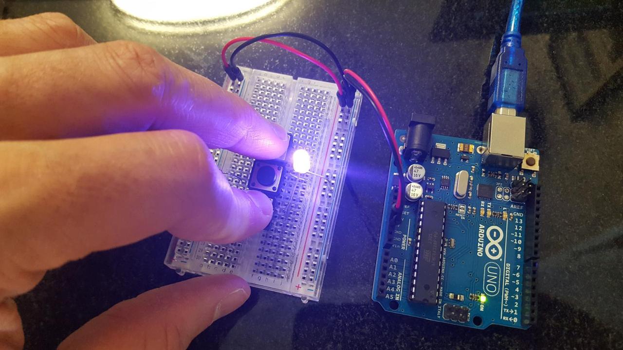
A year ago someone gave me a birthday card that played a song when the card was opened. As I was interested in learning more about circuits, I took apart the card and saved the electrical components for a time when I could dissect them and learn more about how they work. Last week we learned about sound in our physical computing class, so it seemed like a good time to put the inexpensive speaker to good use.
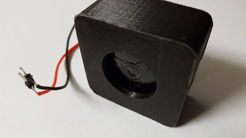
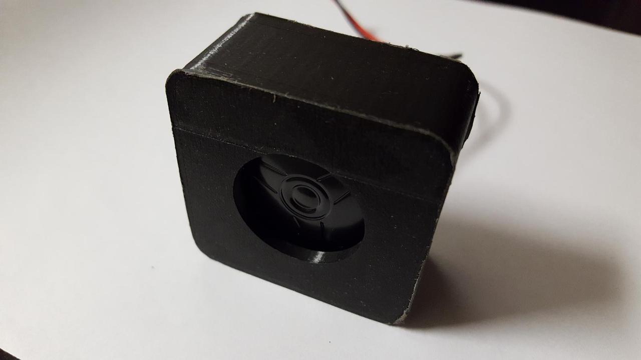
To upcycle the speaker I rewired it to give it red and black wires for the speaker's positive and negative terminals and a header pin to go into a breadboard. I also built a 3D printed case as an assignment for my 3D printing class.