ITP Winter Show 2017
This past week we learned about design composition, and our assignment was to create a poster for ITP's Winter Show. At the end of every semester ITP hosts a show of students' work. The digital and print media advertising the show is designed a student. ITP faculty select one poster design out of many submitted by students. Later this week I am going to submit my design as a potential poster to be used for this winter's show.
Poster Inspiration
I got the idea for this poster before the assignment was given. My fellow ITP student, Max Horwich, posted this Facebook photo he took of himself after building something in the ITP shop:
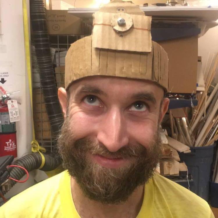
I think this is an amazing photo.
At the same time I had been watching a lot of great Photoshop tutorials to learn how to use the tool. One of them had some inspiring ideas for what to do with Photoshop, including several that superimpose objects above people's heads. Max's photo made me immediately think of a Photoshop opportunity.
Poster Design
My design is below. I took similar photos of a few other students to expand on my idea. The other student is my friend Asha.
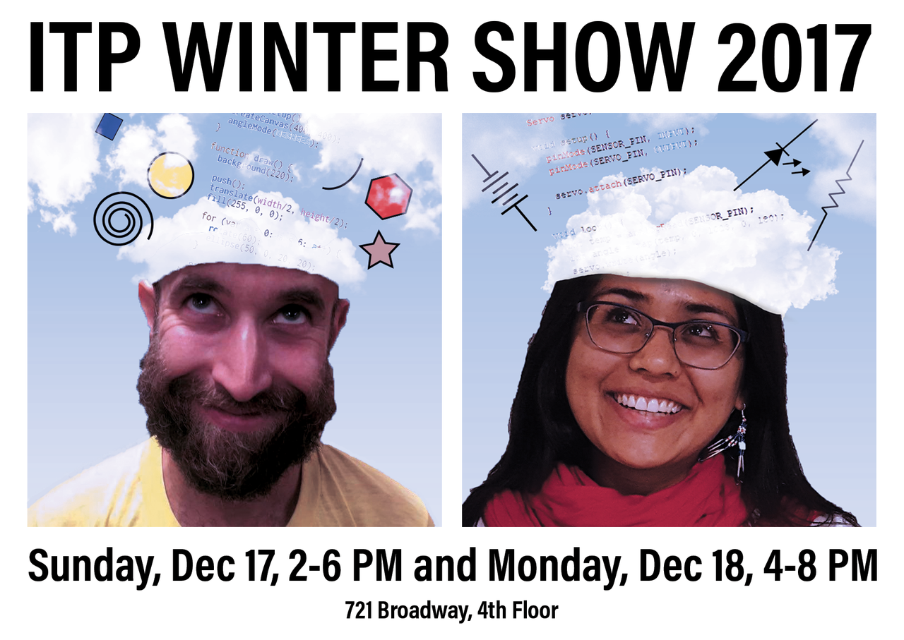
The font is Acumin Pro Condensed Black, found in Adobe Typekit. The color palette mainly sticks to the primary colors of red, yellow, and blue in addition to white and black. I used a grid to layout the locations of the two portraits set between the title and subtitle.
The clouds were created with custom Photoshop brushes created by XResch, which are free to use for non-commercial use. I found them after watching a YouTube tutorial.
This took a lot of time but I had a lot of fun building it. It is clear to me that Photoshop skills are great skills to have and are well worth the investment.
Comments