Posts about visual language

Business Cards

Our final Visual Language assignment is to design business or personal cards. It happens I already had personal cards but I wanted to update my design to incorporate what I have learned in this class.

The main goal of my cards is to provide some interaction and enjoyment to the people I give them to. Usually cards are boring and are tossed into a drawer somewhere shortly after they are received. Often they are given out to communicate status or corporate identity. I want my cards to be different. I want to communicate my ability to be creative and engage people in a unique way. And I do that by designing connect the dots puzzles for the backside of my cards.

Read more…

ITP Winter Show 2017

This past week we learned about design composition, and our assignment was to create a poster for ITP's Winter Show. At the end of every semester ITP hosts a show of students' work. The digital and print media advertising the show is designed a student. ITP faculty select one poster design out of many submitted by students. Later this week I am going to submit my design as a potential poster to be used for this winter's show.

Poster Inspiration

I got the idea for this poster before the assignment was given. My fellow ITP student, Max Horwich, posted this Facebook photo he took of himself after building something in the ITP shop:

Max, smiling and looking up at the odd cardboard hat sitting on his head.

I think this is an amazing photo.

Read more…

Color Palette

This week we learned about the use and importance of color in design. Our assignment is to create a color palette that represents us and then use it in several compositions.

This is the color palette I came up with. The primary color is #882222 which is currently the specific shade of red used in my blog's side menu. I happen to like the shade of red a lot. The other colors were selected using Google's Color Selector Tool. I tend to not like the color blue that much but I thought it did compliment the reds quite well so I decided to stick with it.

Eight small circles arranged in a circle, three of which are reddish brown, three are bluish, and the other two are black and white.

Read more…

Typography and Expression

This week we learned about typography and how font choices contribute to our design decisions. Fonts and typography contribute much to how well information is communicated to others.

I wanted to learn more about Adobe Illustrator so I went through some tutorials to get a basic understanding of the application, then dove into these assignments.

Expressive Words

Our first assignment is to create expressive words. Expressive words are representations of words that convey the meaning of the word through the fonts used to display the word.

Using a thesaurus for ideas, I picked the word opaque. The word is displayed in a bold black font with its antonyms layered behind it in semi-transparent colors.

The word "opaque" in the center with words related to transparency like glassy and diaphanous randomly placed behind it.

Read more…

Signage and Information Systems

This week's topic is signage and information systems. Our assignment was to find examples of well designed signage and analyze what it is that makes it effective, and to find examples of poorly designed signage.

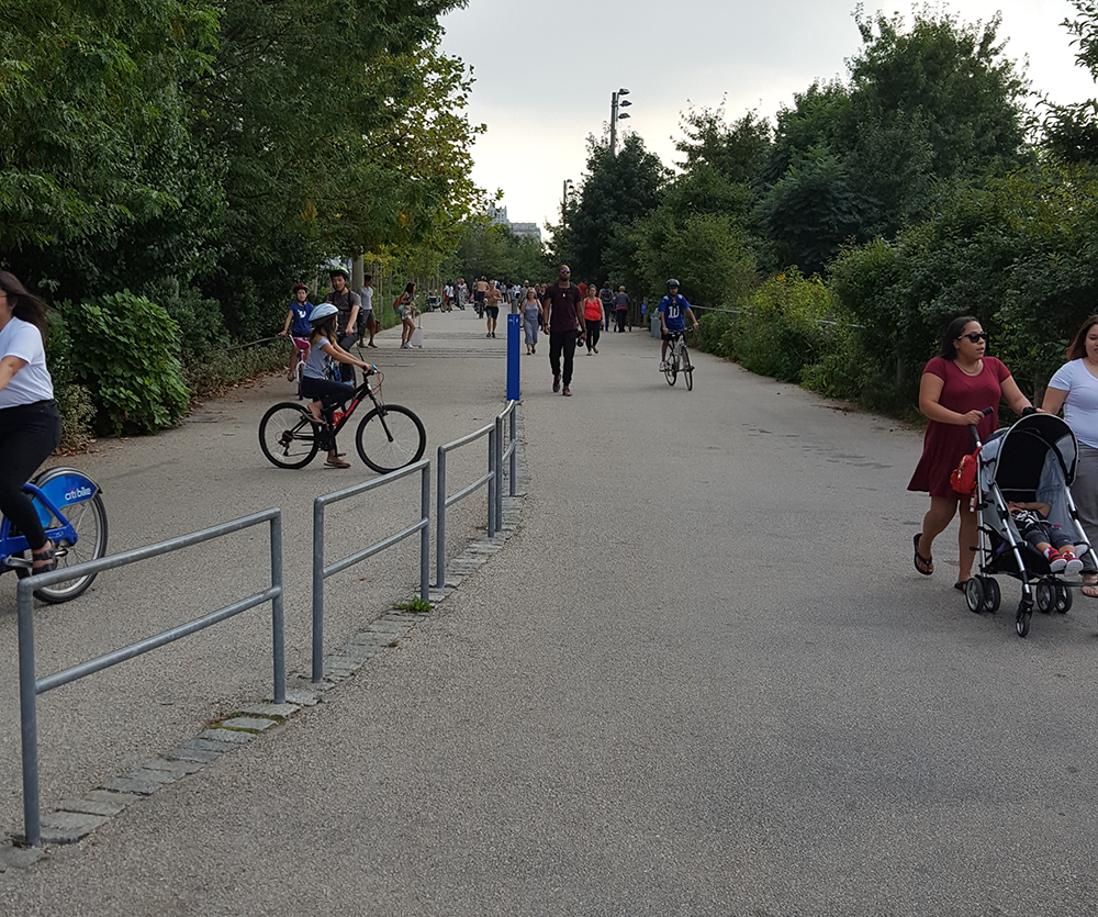
My first thought of poor signage is in Brooklyn Bridge Park. I live in the area and do volunteering there on a regular basis. In the park there is a path running through the entire area that is open to bicycles and pedestrians. Here is an example:

bike and pedestrian path in park with trees to the right and left and a metal fence going down the center. A small blue post delineates which side of the path is for bikes and which side is for people.

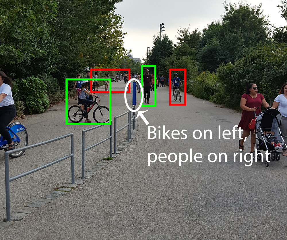
There is a mixture of people and bicycles everywhere. It's hard to notice the tiny blue sign in the middle that instructs bicyclists to stay on one side of the path and pedestrians on the other side. There are only a couple of signs like this anywhere along this mile-long path. This is an accident waiting to happen.

Bike and pedestrian path in park. Bikes and people who are where they are supposed to be have a green box around them. Those that do not have a red box. The text "Bikes on Left, People on Right" is added to the center of the image.

Read more…

Basic Design Principles

Our first assignment is to choose a design we like and analyze its adherence to the principles of design. We needed to look at the grid system, color system, and the fonts.

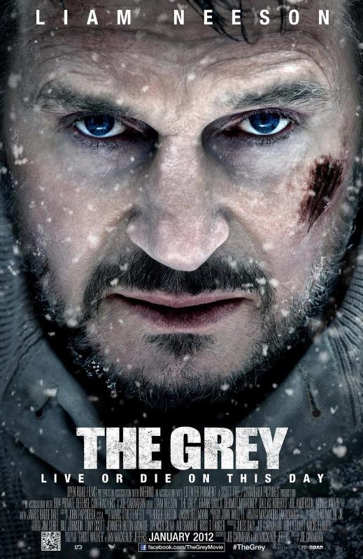
I picked the movie poster for the movie The Grey. I find the imagery to be visually striking in a way that is consistent with Liam Neeson's character in this movie.

The most primary feature of this poster are Neeson's eyes. His eyes are the most noticeable and are the only blue thing illustrated on the poster. After his eyes, the prominent features are the movie's title and the redness of his mouth and the cut on his face.

Movie poster for the movie The Grey. A close-up of Liam Neeson's face, which has a beard and several cuts on it.

Read more…