Color Palette
This week we learned about the use and importance of color in design. Our assignment is to create a color palette that represents us and then use it in several compositions.
This is the color palette I came up with. The primary color is #882222 which is currently the specific shade of red used in my blog's side menu. I happen to like the shade of red a lot. The other colors were selected using Google's Color Selector Tool. I tend to not like the color blue that much but I thought it did compliment the reds quite well so I decided to stick with it.

Using these colors I created several compositions in Illustrator and Photoshop. I had a good time learning how to better use these tools. For all of these compositions I used a custom Color Palette and Color Table made just for this assignment.
First, an abstract drawing. The starting point for those color bars is a thick dashed line.

Next I learned how to use Illustrator's pattern tool. In class we saw an example of a blog composed entirely of pictures of repeating patterns. I wanted to learn how that was done. Happily, Illustrator has a built-in tool for making similar drawings. This is a useful feature that would have been helpful during last week's assignment when I had to depend on Adobe's built-in patterns.
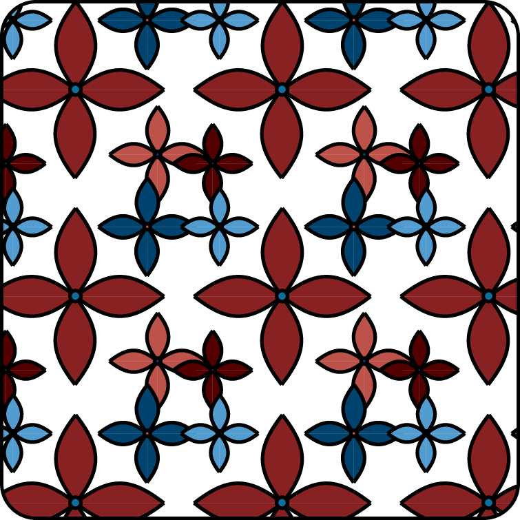
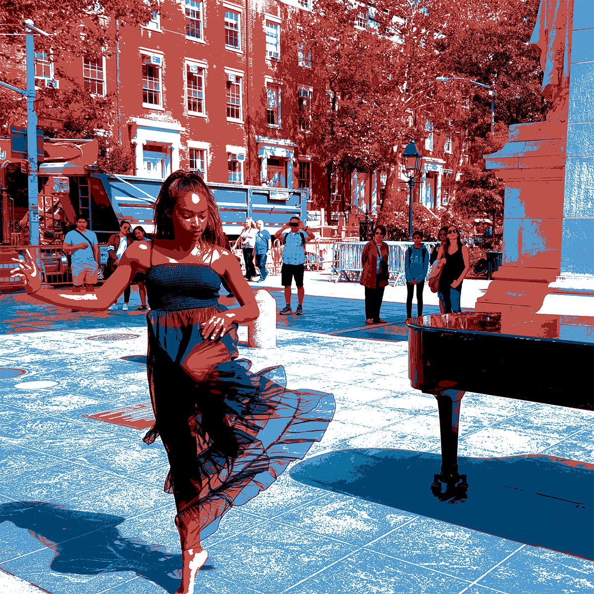
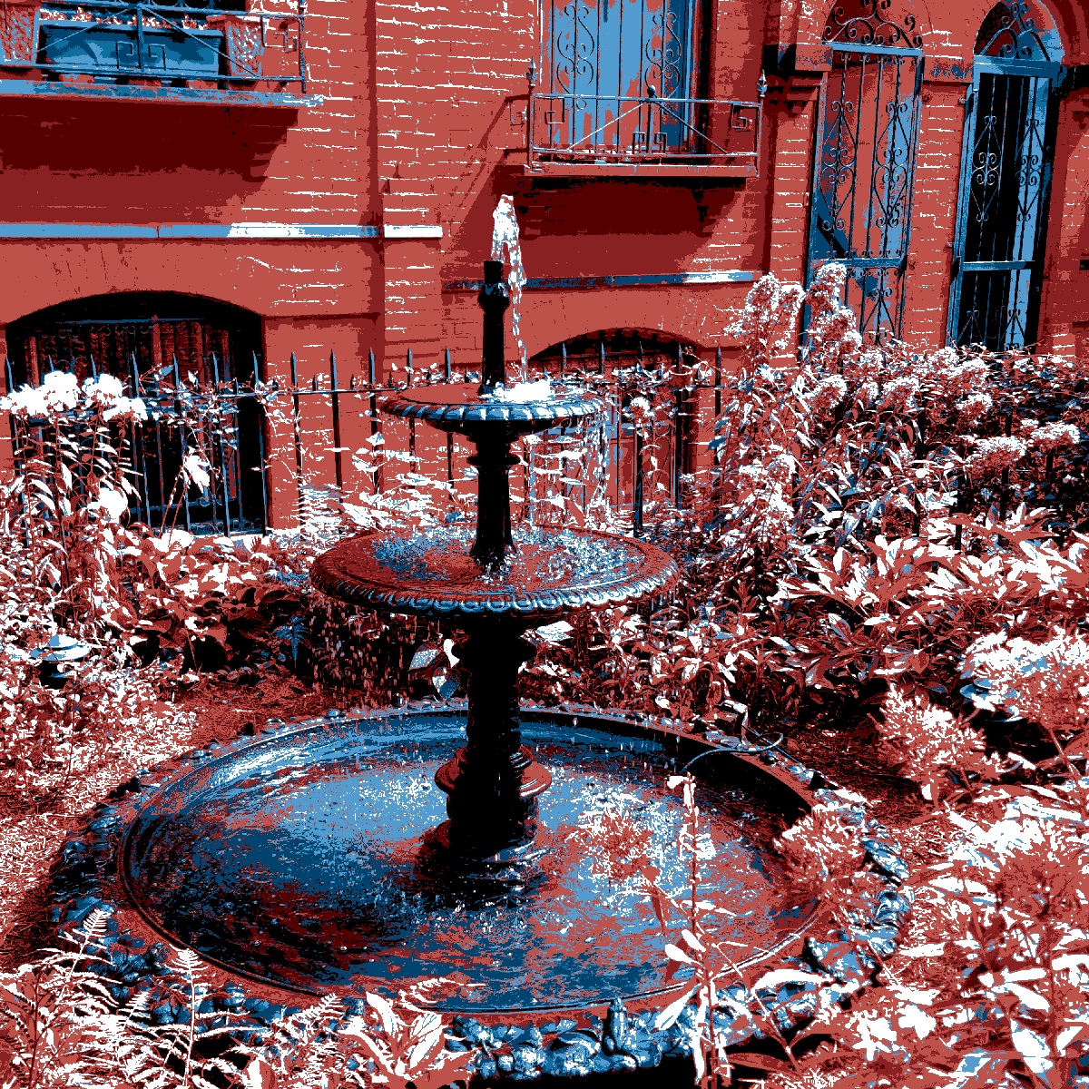
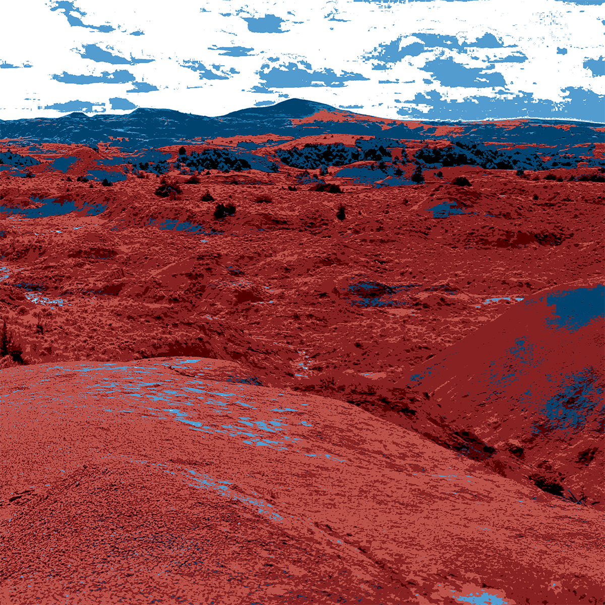
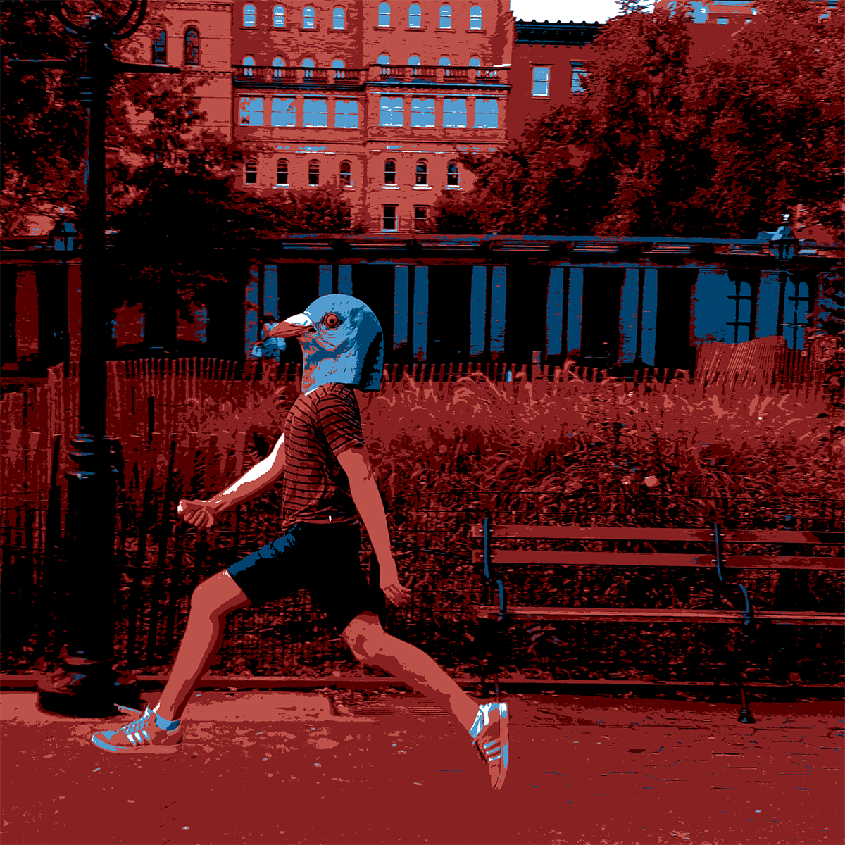
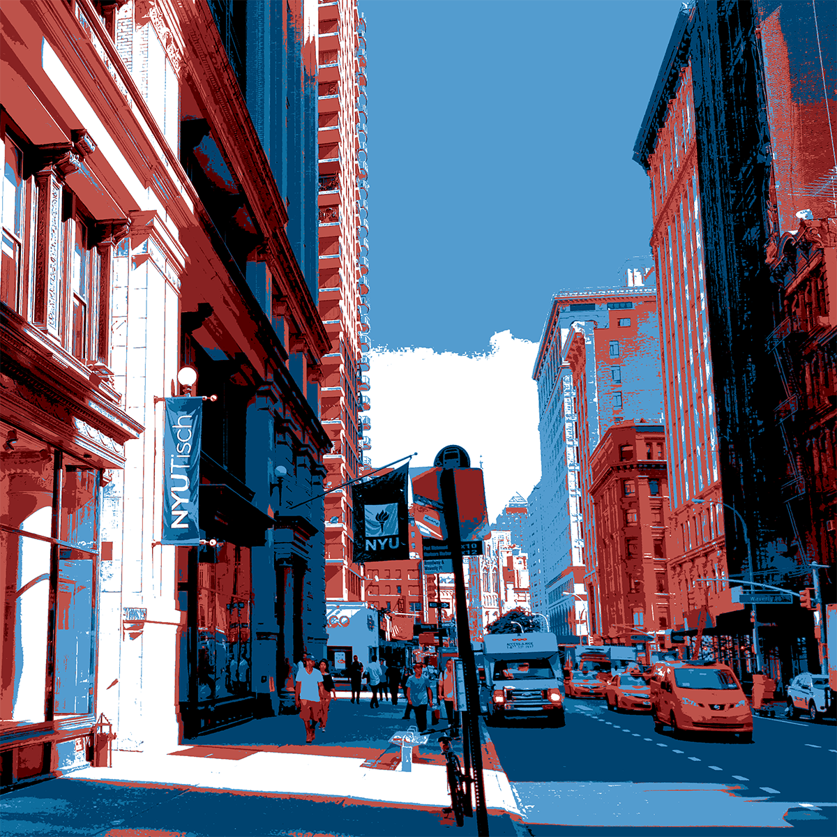
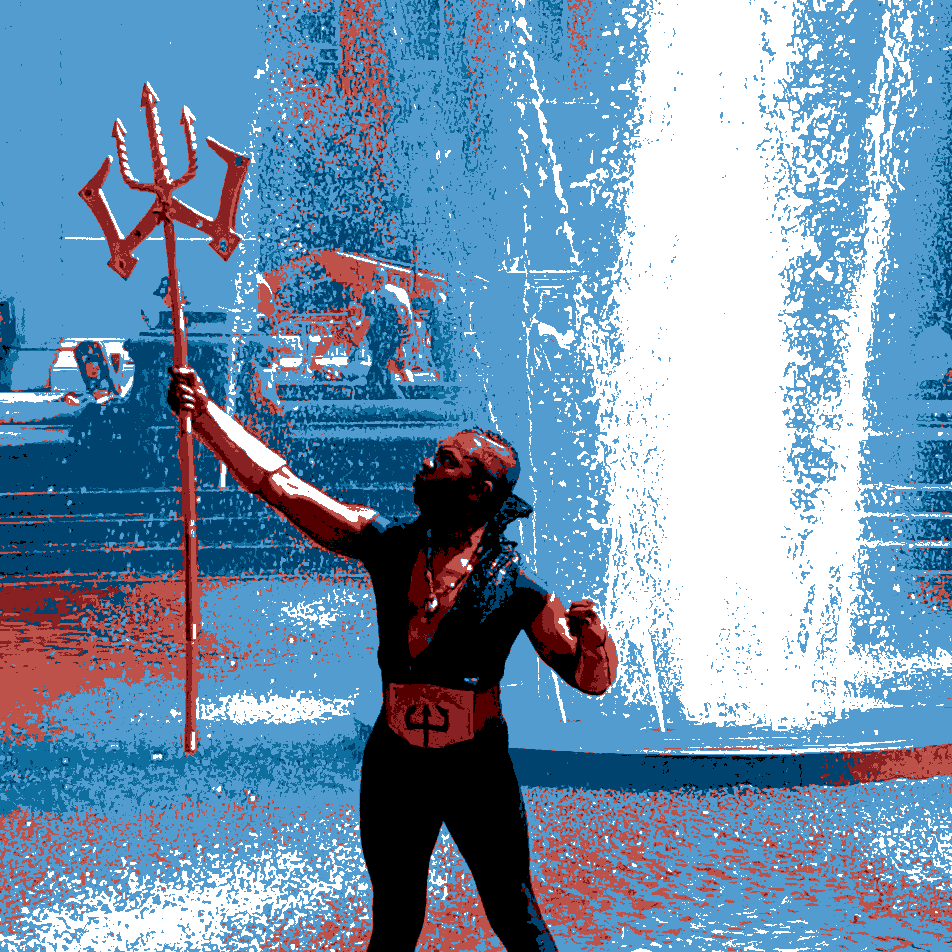
I also wanted to learn how to use Photoshop to reduce a photograph to a specific limited set of colors. This can be done by converting the image to Indexed Colors and a custom color table. All of the below photos were taken by me in the past few months.
This is a photo of a talented woman dancing while my friend Colin played piano in Washington Square Park:
This beautiful fountain is located on Warren Place in Cobble Hill.
This landscape photo is from a cattle ranch in Montana.
Here is a photo someone running through Washington Square Park with a hotdog bun:
And the front of the Tisch building:
And finally, Poseidon in the fountain in Washington Square Park:
Comments