Homeownership Illustrations
In class we have been studying Semiotics, which is the study of meaningful communication through signs and symbols. The final version of my Homeownership field guide needs meaningful signs and symbols to help the reader process and remember the information.
I started using Adobe Illustrator again and have been hard at work making illustrations. It would certainly be faster to download images from The Noun Project but I'd rather make them myself. I can make the design more consistent and I'll get more experience with Illustrator. I did find The Noun Project useful for inspiration and for suggestions of signs and symbols that would be understood by others.
The main idea I want to communicate is the view that a home is a source of energy to the individual and the community. To illustrate a home I will use a typical house-shaped profile that is reminiscent of a Monopoly house. In the center of the house illustration I will add something suggestive of energy or power. In my Draft Field Guide I thought I could use a power cord coming out the side but Marina suggested that what I am trying to communicate might be confused with electricity.
With that in mind, here are some alternatives.
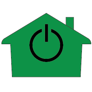
First, a house with a power button in the center. To be honest I don't like this one very much.

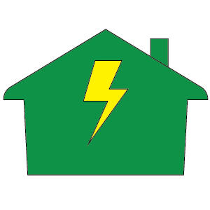
Next, a house with a lightening bolt.

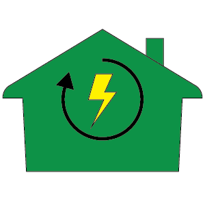
The image gets better when I draw a circular arrow around the lightening bolt. The arrow helps communicate that something is happening because of the lightening bolt.

A different idea is to use a gear instead of lightening.

And a gear with the arrow.

I like the arrow because it helps communicate that something is happening inside the house. I can't decide if I prefer the lightening bolt or the gear. And the colors? Is that shade of green a good choice? It happens to be the same color as Monopoly houses but I find the color itself to be ugly.
Perhaps as I design more of the illustrations these design decisions will become more clear.
Comments