Basic Design Principles
Our first assignment is to choose a design we like and analyze its adherence to the principles of design. We needed to look at the grid system, color system, and the fonts.
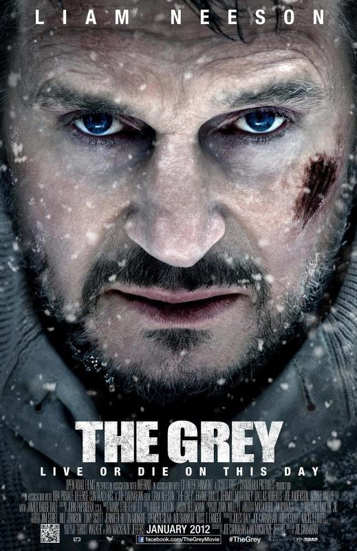
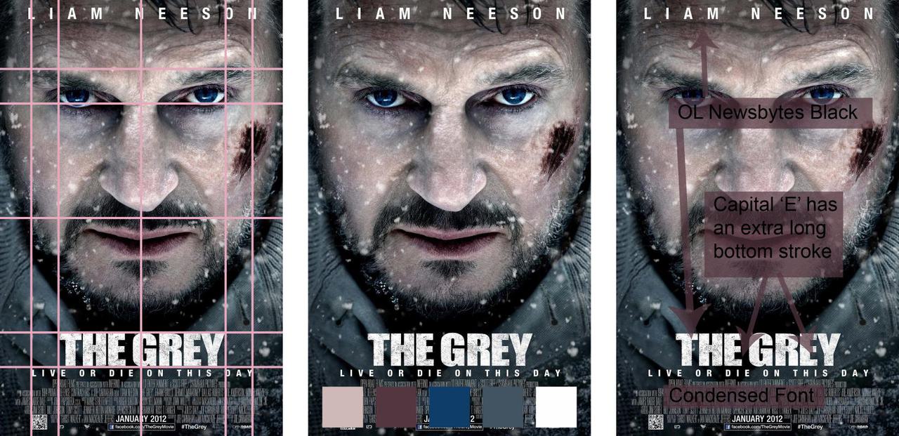
I picked the movie poster for the movie The Grey. I find the imagery to be visually striking in a way that is consistent with Liam Neeson's character in this movie.
The most primary feature of this poster are Neeson's eyes. His eyes are the most noticeable and are the only blue thing illustrated on the poster. After his eyes, the prominent features are the movie's title and the redness of his mouth and the cut on his face.
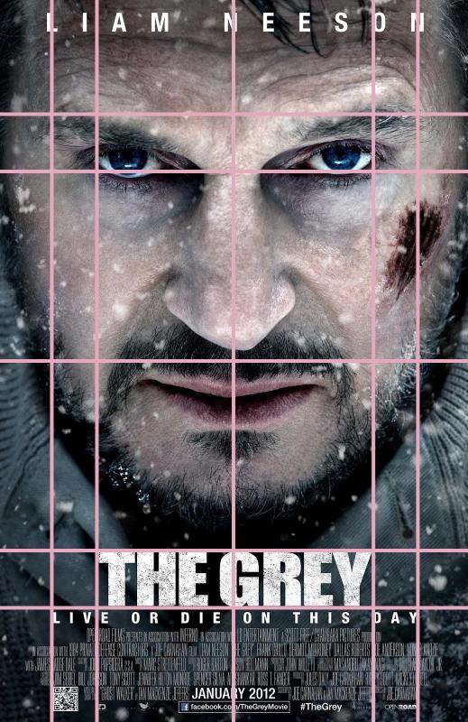
The grid system of the poster seems to have been designed to have symmetry between his eyes and the movie title. This is most noticeable with the vertical grid lines. You will see that the outer edges of his eyes line up with the edges of the movie title. The edges of the subtitle line up with outer edges of his eyebrows. Also, the title is the same distance from the bottom as his eyes are from the top.
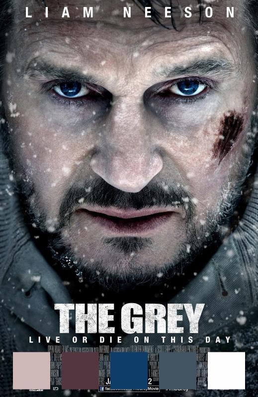
The color system of the poster makes heavy use of shades of gray and Neeson's skin color. Red and blue are used sparingly, and as a result accentuate his eyes, mouth and the cut on his face.
The font identified by What The Font is OL Newsbytes Black.
Although OL Newsbytes Black is very similar to the font in this poster, I can see that the capital R character a little bit different. OL Newsbytes Black Has a curve at the foot of the capital R but in the poster the capital R has a straight bottom stroke. This was probably modified to allow the letters to be placed as close together as possible.
One somewhat unique feature of both OL Newsbytes Black and the font used in this poster is the bottom stroke of the capital E. The bottom stroke of this letter is longer than the top stroke.
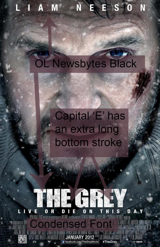
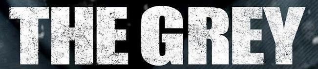
This is the case for all capital E letters found in the poster but it is most noticeable in the title:
And finally, here's all of the analysis together in one collage:
Comments